Research Poster
The objective of a research poster is to display information in a clear, concise manner while generating interest to engage in a discussion.
Poster Content
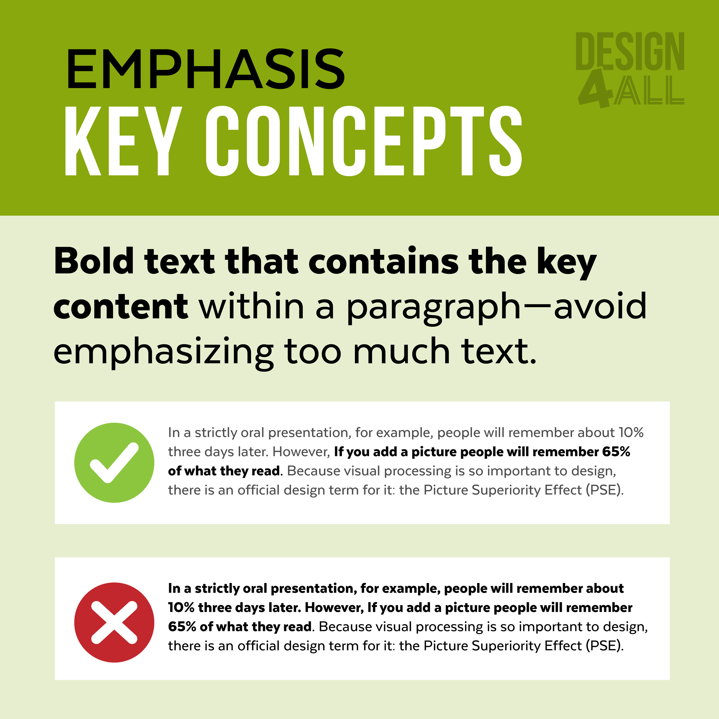
Adding a lot of content—more information doesn’t necessarily mean you will communicate more and can lead to the reader being confused or hesitant to even look at your content because of the feeling overwhelmed.
Quick Tips
Important information should be readable from about 10 feet away.
Title is short and draws interest.
Subtitles can be longer and include the research question.
Word count of about 300 to 800 words.
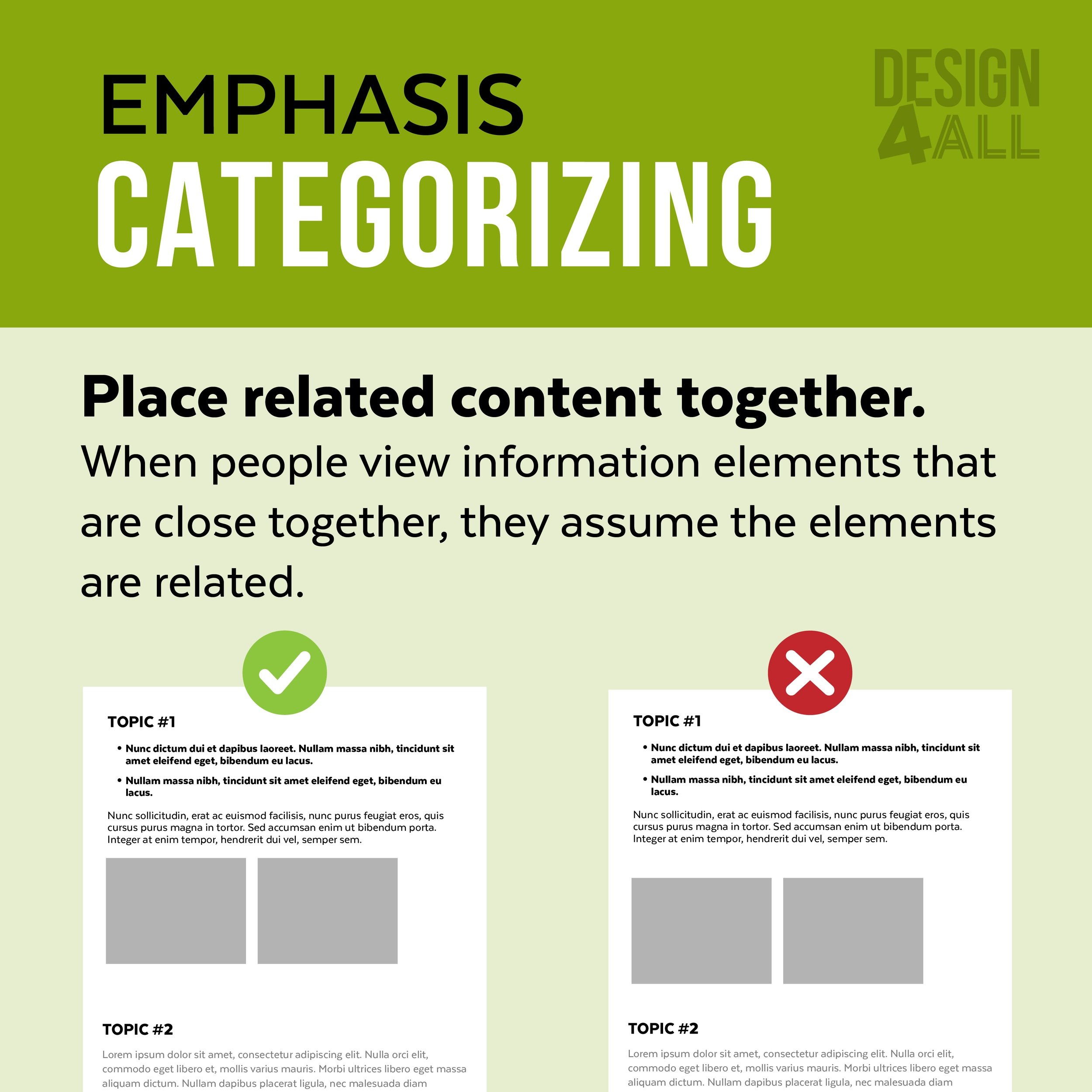
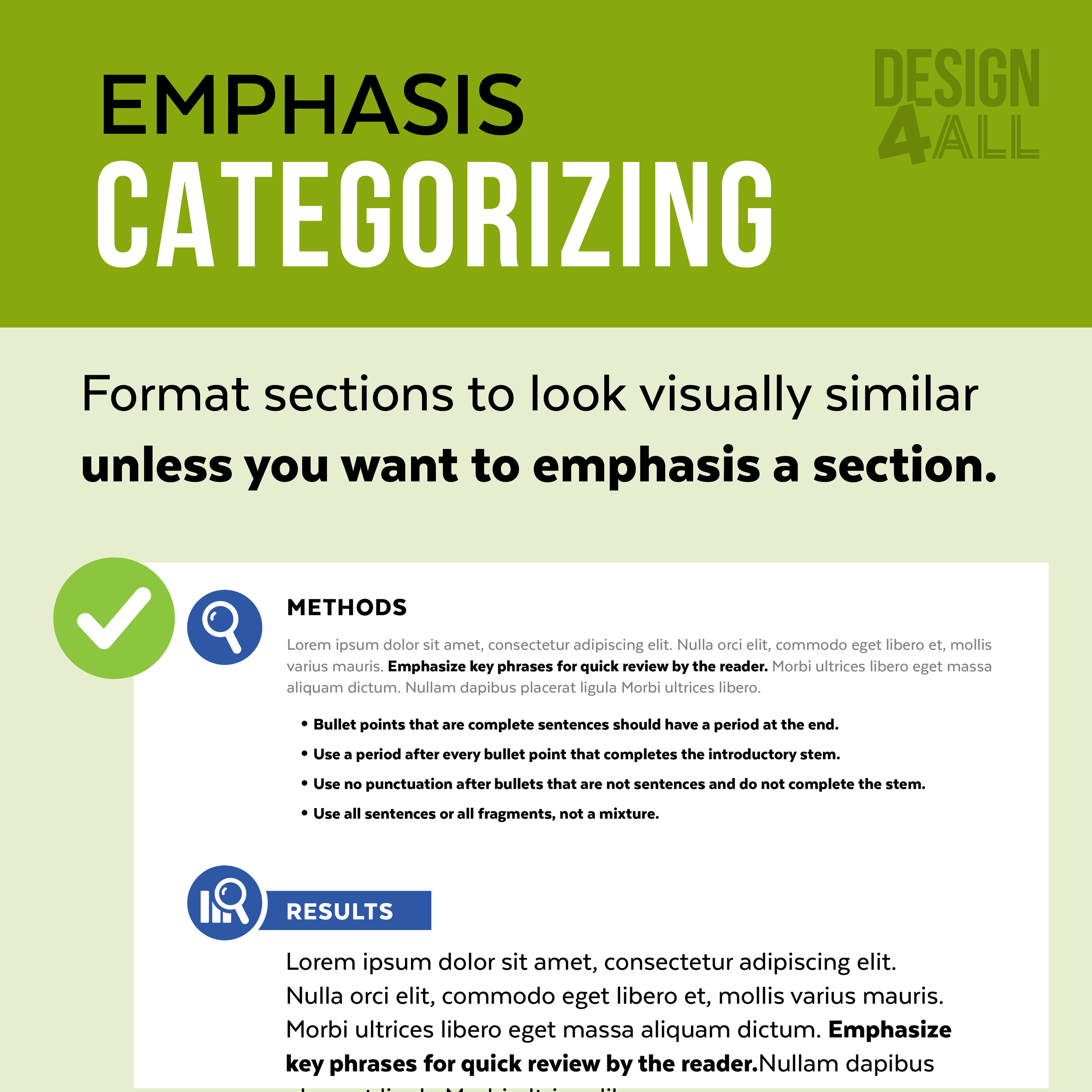
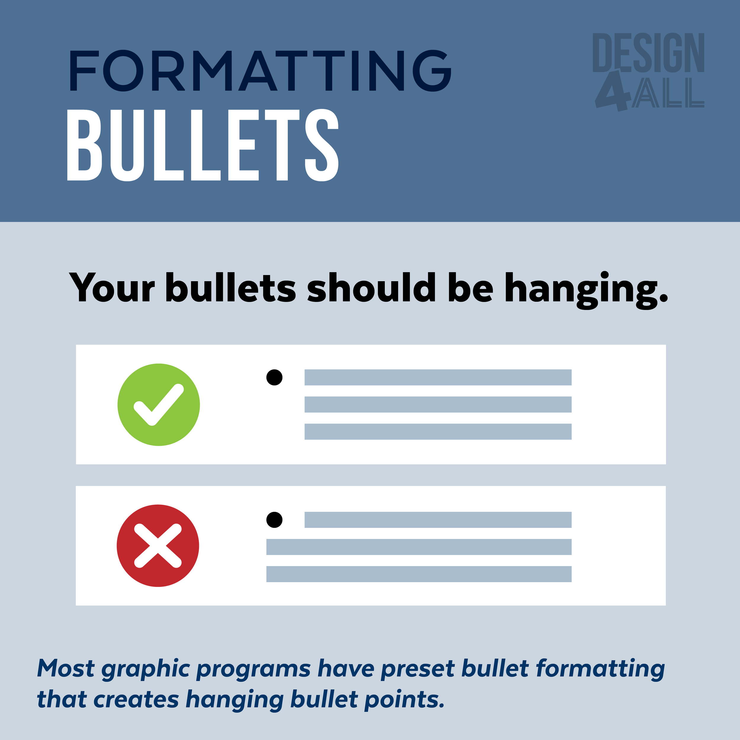
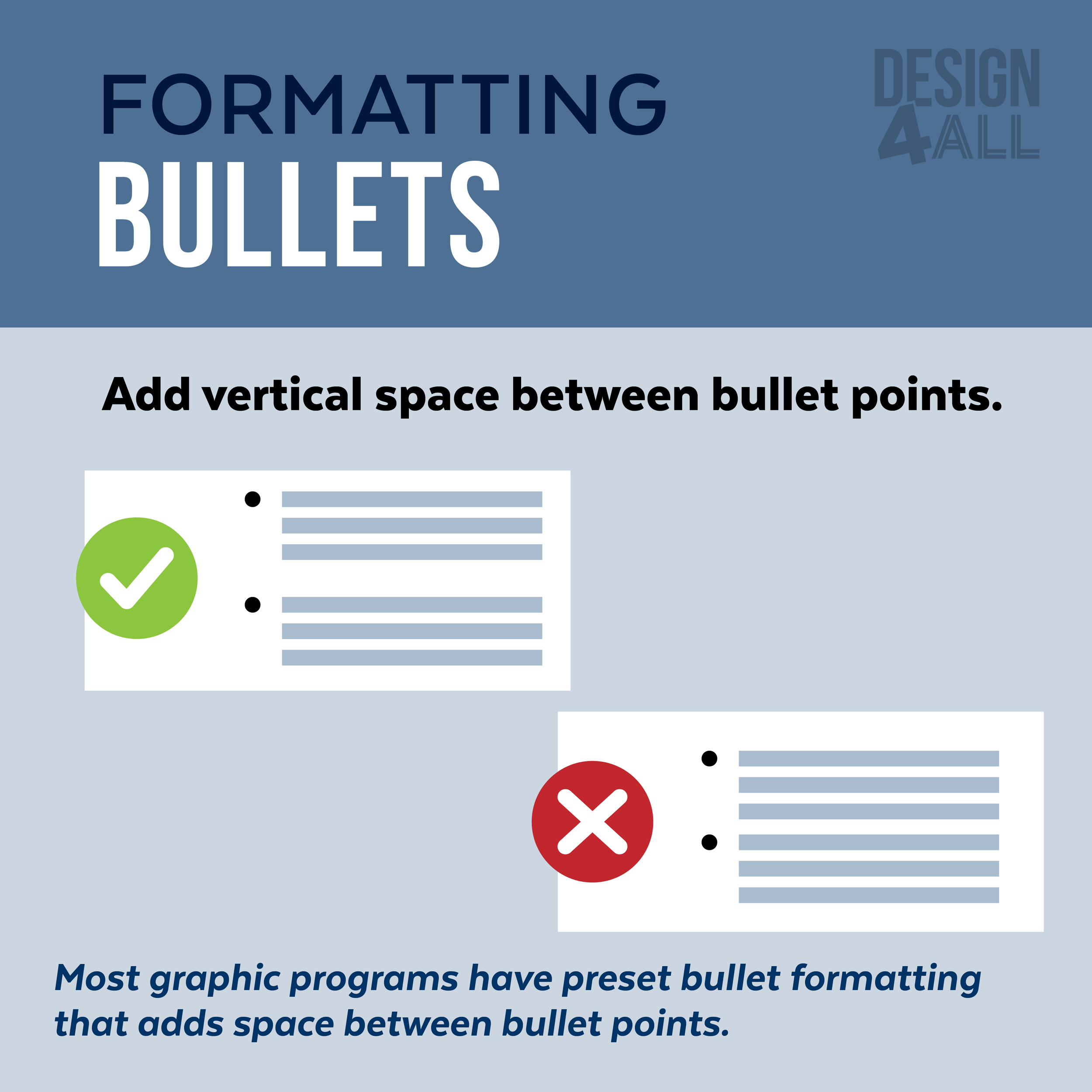
Create sections that organize information logically: The use of bullets, numbering, and headlines makes it easy to read.
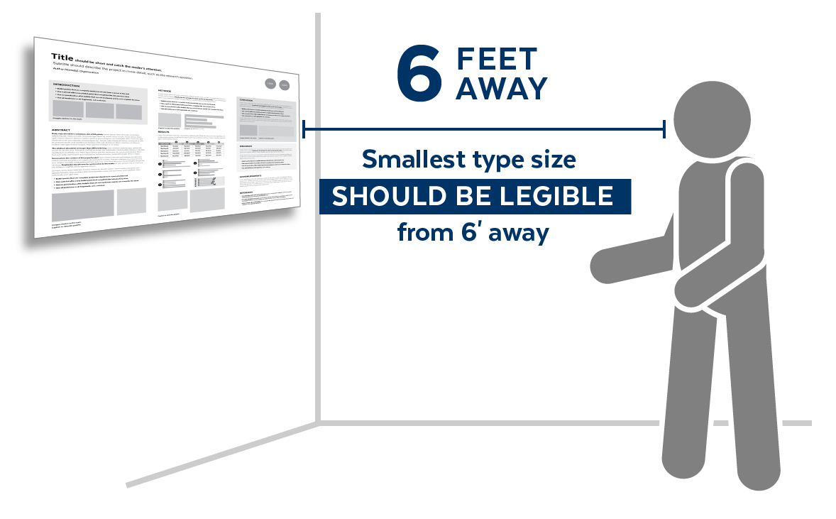
The smallest type size should be legible from 6 feet away.
Titles: 72 points
Headings: 48 points
Body Copy: 24 points
Poster Design #1
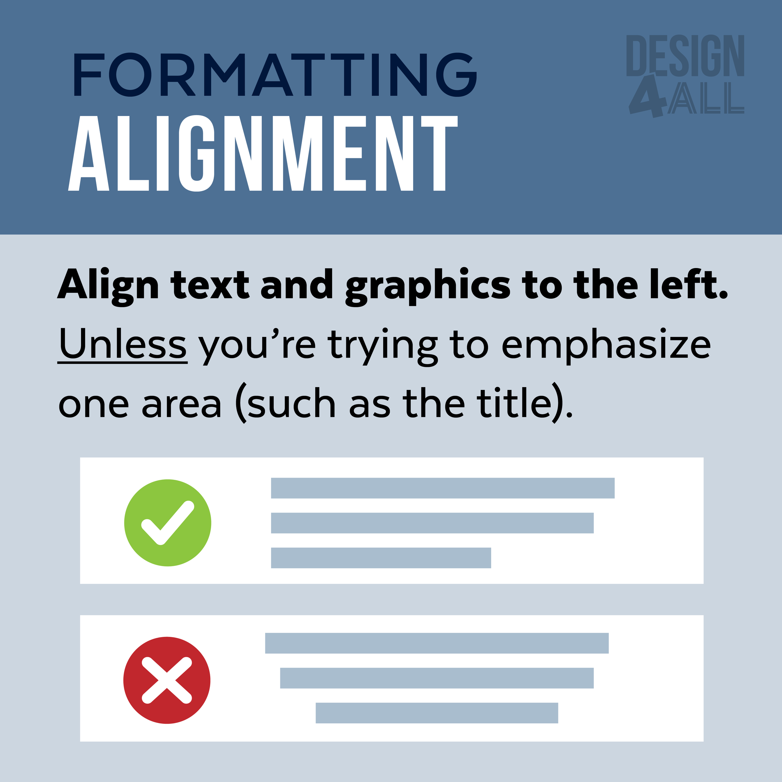
The design exhibits good margins and alignment.
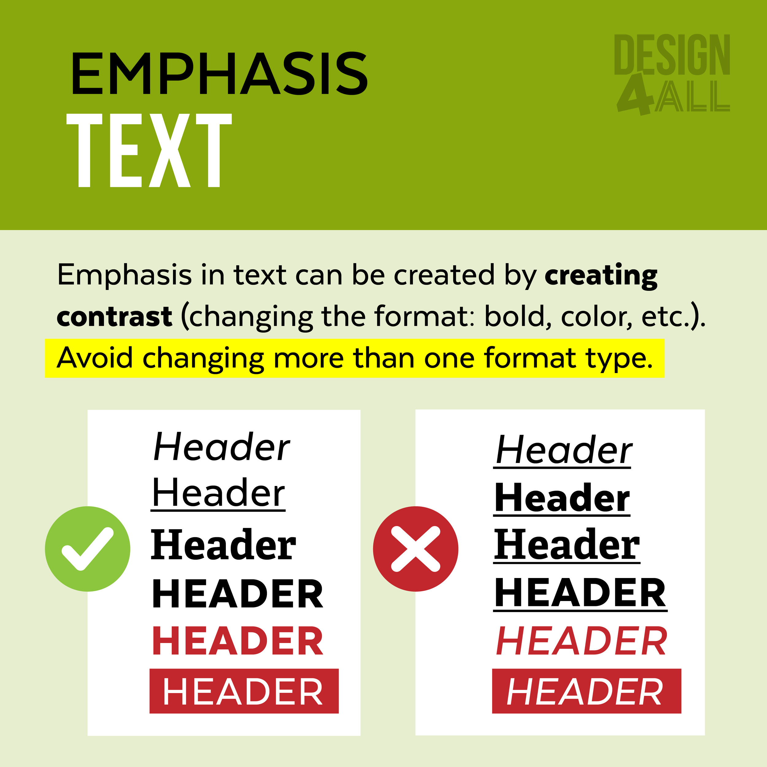
This design implements a visual hierarchy by using different font styles for headers and changing the background color.
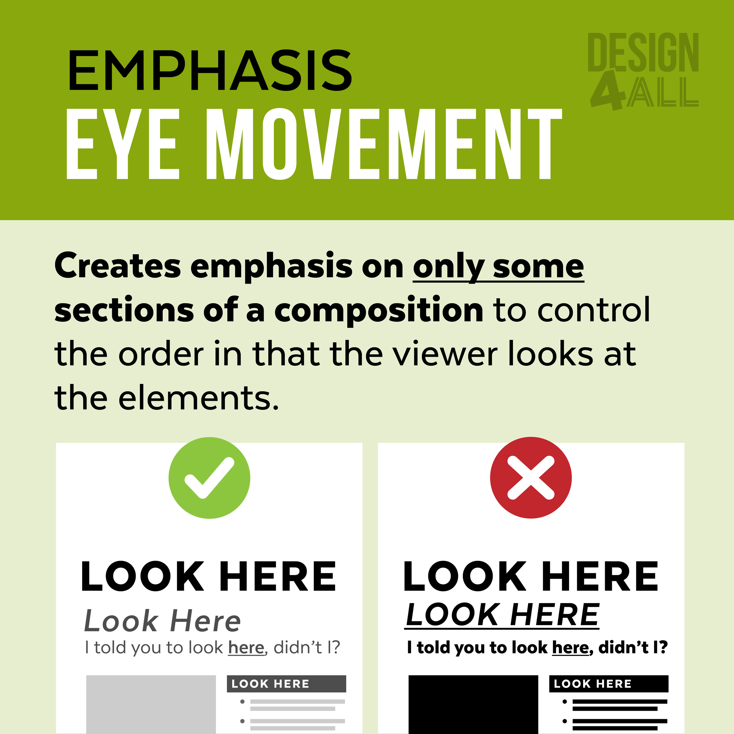
This design uses white margins around the sections with photographs and the background color is distracting and poorly affect the eye movement of the viewer.
This design lacks much visual interest.
Poster Design #2
This design exhibits a visual hierarchy by using different font styles for headers and changing the background color.
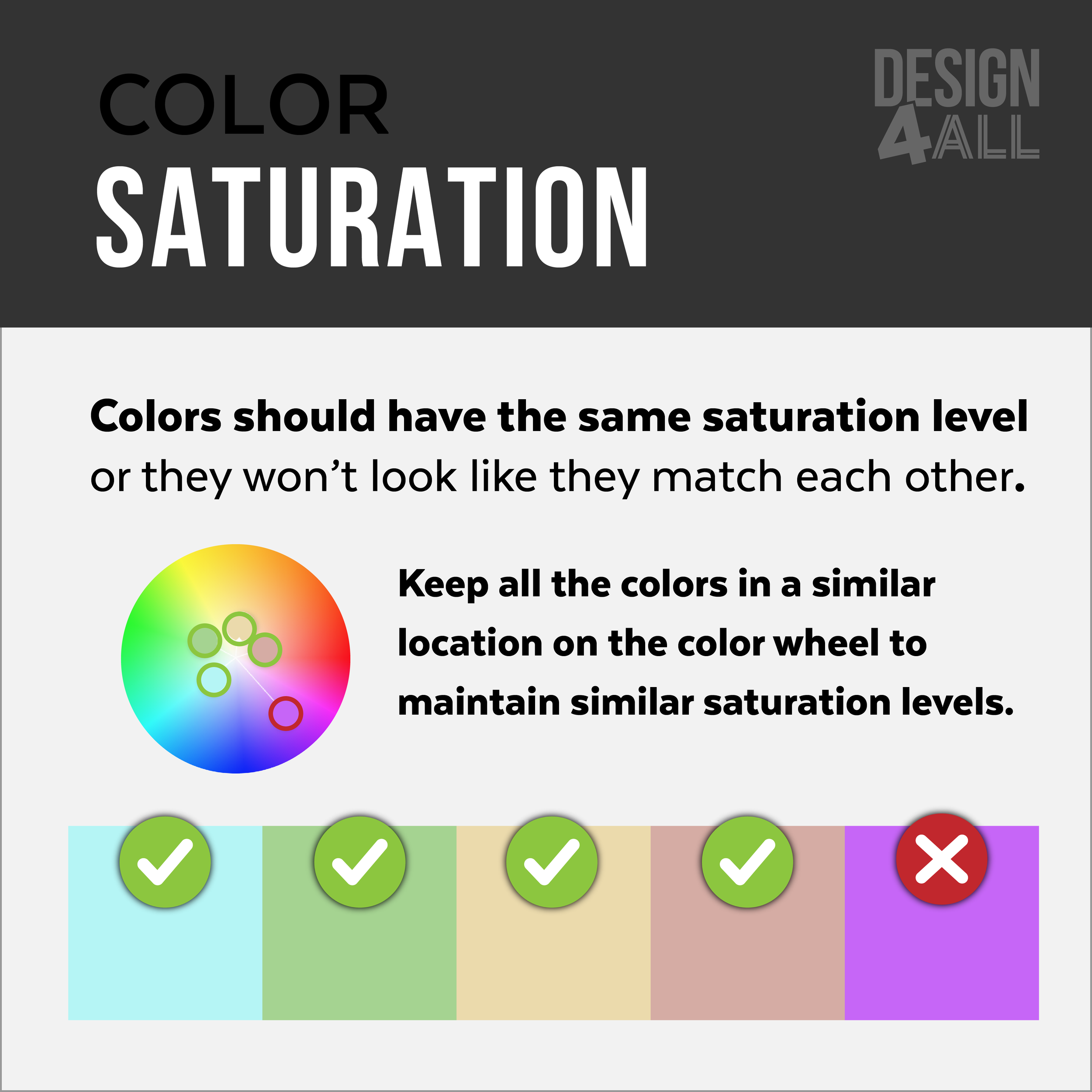
This design adds visual interest by using a coordinating color palette and adding appropriate imagery.
This design uses white margins around the sections with photographs and the background color is distracting and poorly affect the eye movement of the viewer.
Poster Design #3
This design effectively exhibits a visual hierarchy by using different font styles for headers and changing the background color.
This design adds visual interest by using a coordinating color palette and adding appropriate imagery.
This design effectively controls the eye movement of the viewer to the appropriate content by not being distracted by unnecessary (high contrast) areas (white margins).
Graphic Downloads
Design Software
There is affordable and helpful design software available to use for designing Research Posters and Informational Graphics.
Canva.com (Free Versions)
Piktochart.com (Free Versions)
Adobe® Express (Free Versions)
Microsoft® PowerPoint

