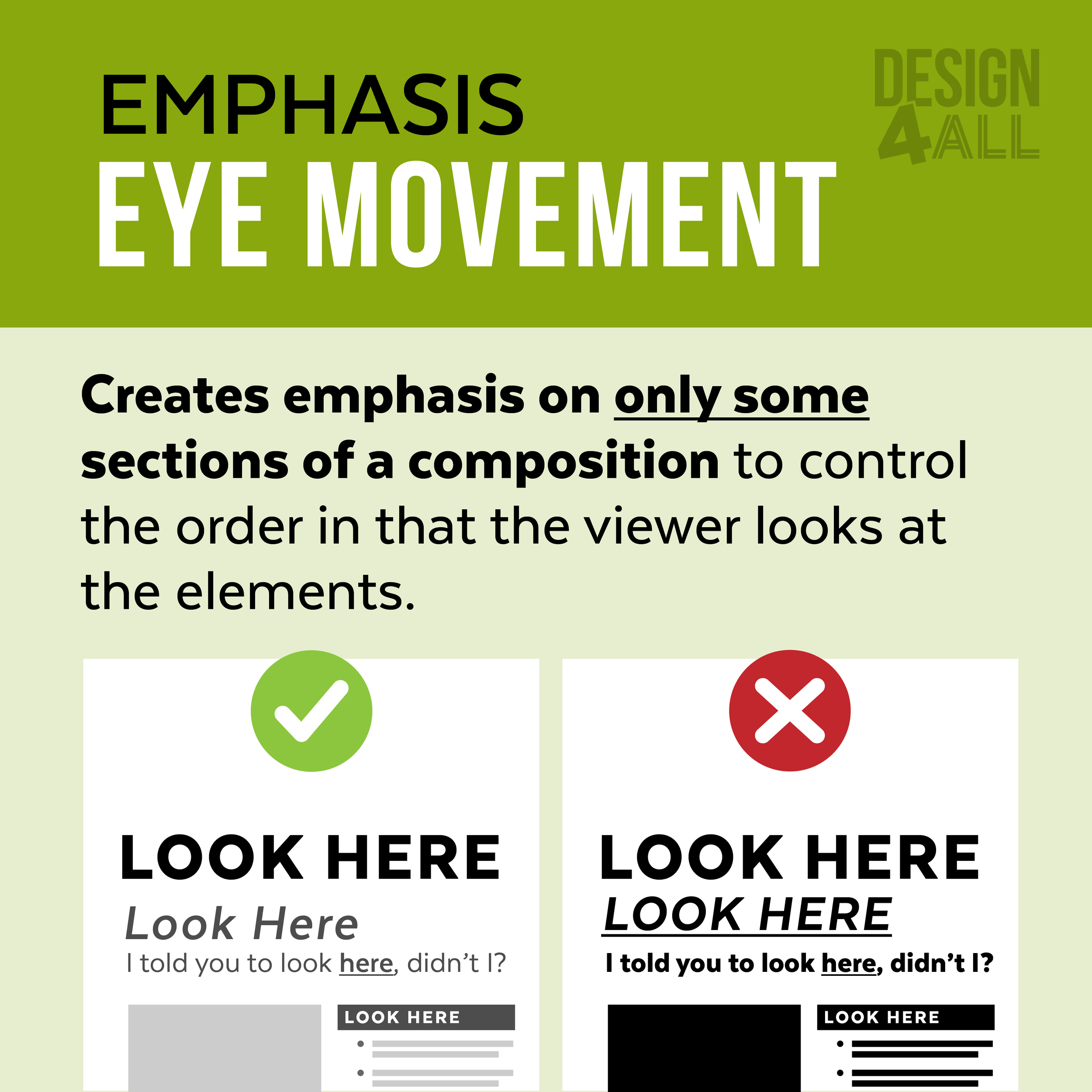
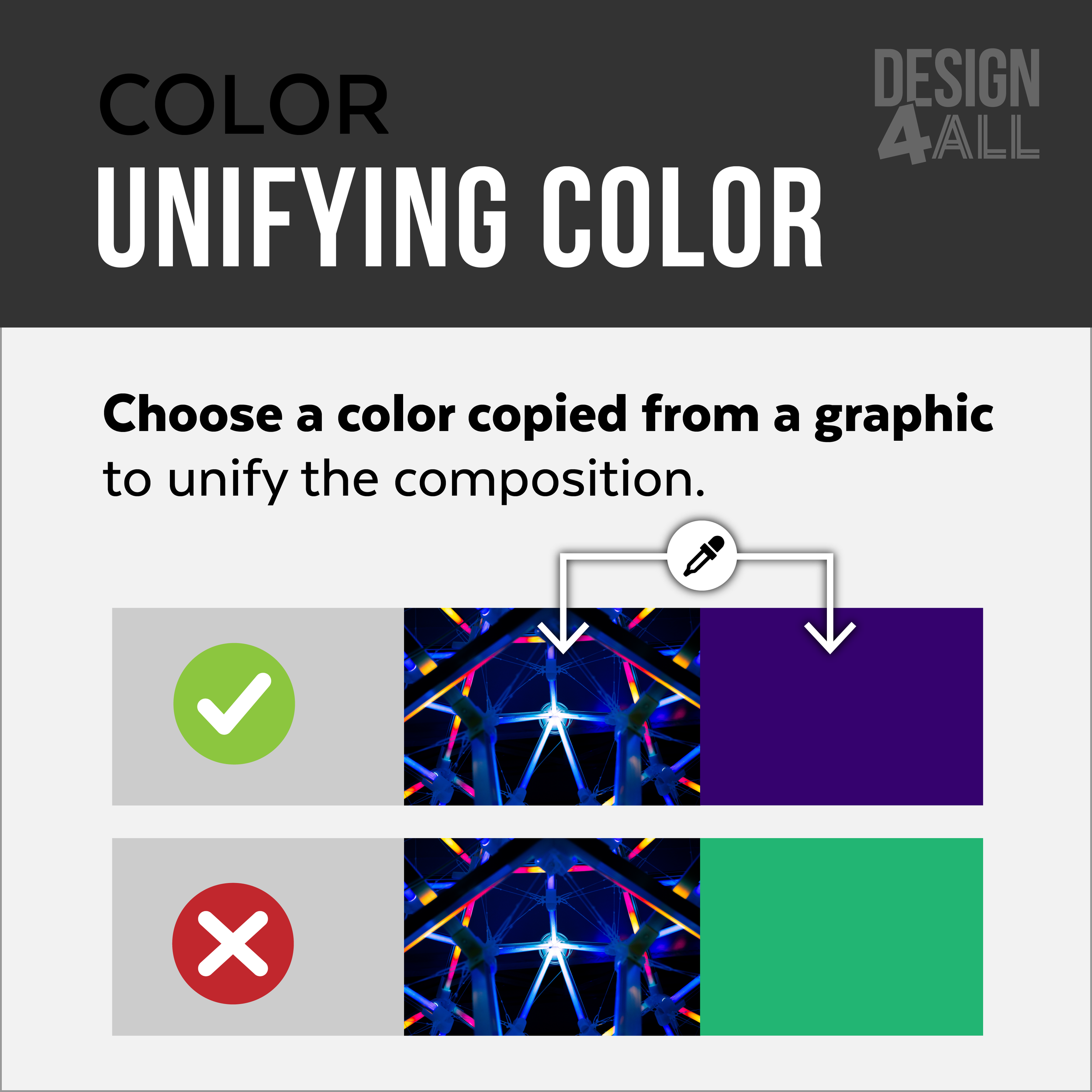
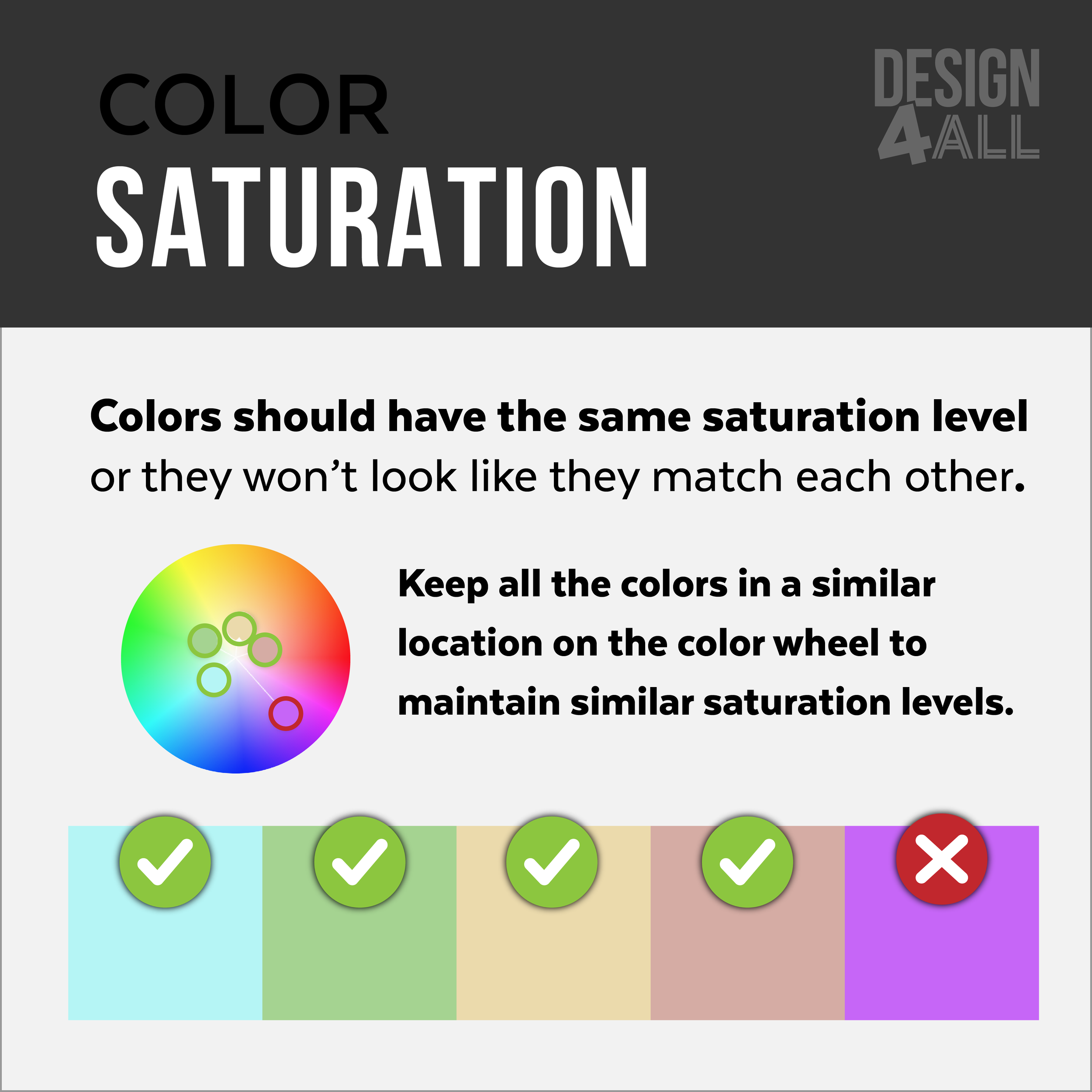
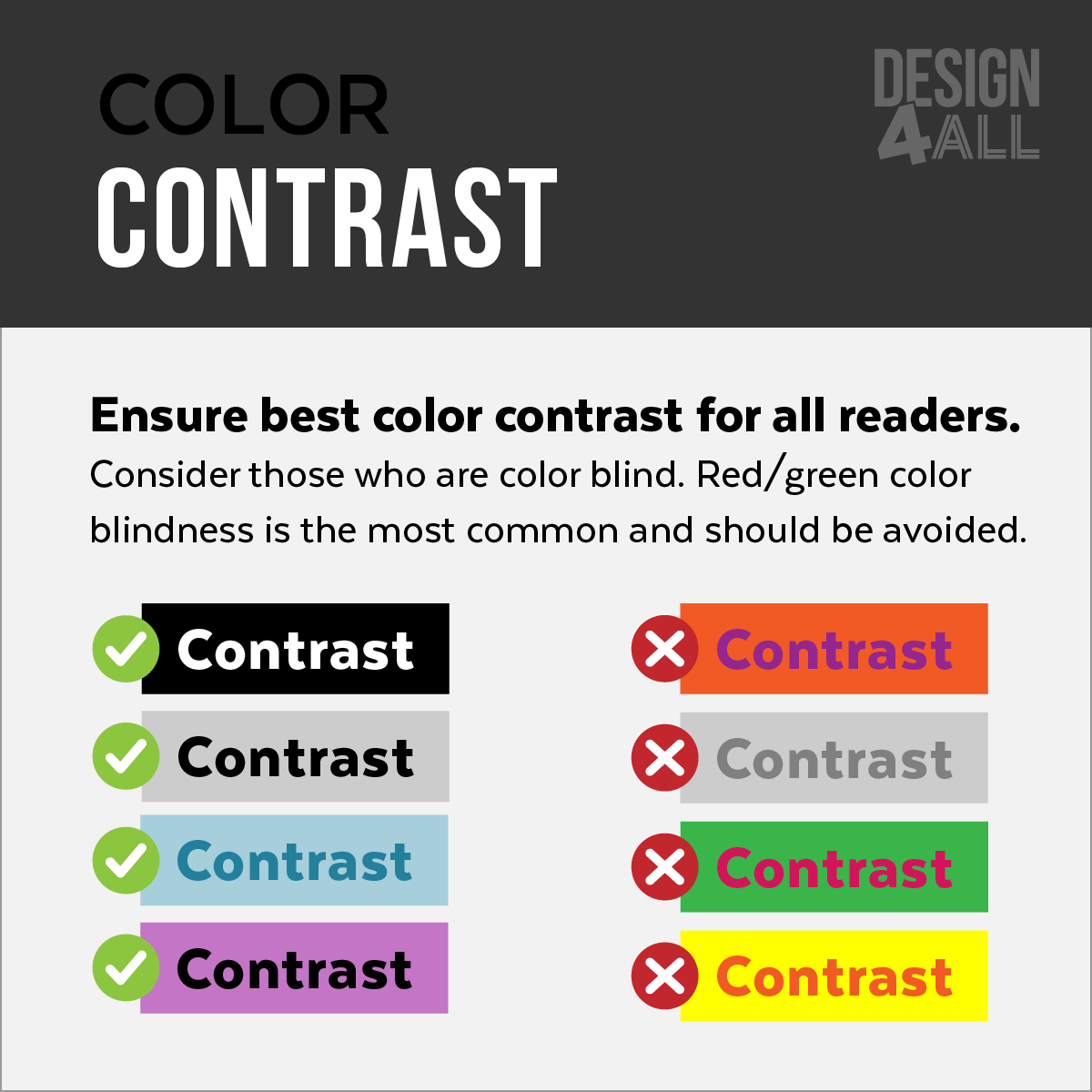
Emphasis: Categorizing
Place related content together. When people view information elements that are close together, they assume the elements are related.

Emphasis: Categorizing
Format sections to look visually similar unless you want to emphasis a section.

Emphasis: Eye Movement
Creates emphasis on only some sections of a composition to control the order in which the viewer looks at the elements.

Emphasis: Key Concepts
Bold text that contains the key content within a paragraph—Avoid emphasizing too much text.

Emphasis: Numbers
Emphasize the numbers when presenting statistics to highlight the data.

Emphasis: Text
Emphasis in text can be created by creating contrast (changing the format: bold, color, etc.). Avoid changing more than one format type.

Formatting: Alignment
Align text and graphics to the left. Unless you’re trying to emphasize one area (such as the title).

Formatting: Bullets
Your bullets should be hanging.

Formatting: Bullets
Add vertical space between bullet points.

Formatting: Text Hyphenation
Avoid Hyphenation. Hyphens make it harder to read. Only use hyphenation with narrow columns.

Formatting: Text Columns
Use appropriate column widths. The ideal column width is 52–65 letters wide.

Color: Unifying Color
Choose a color copied from a graphic to unify the composition.

Color: Saturation
Colors should have the same saturation level, or they won’t look like they match each other.

Color: Rainbows
Avoid using rainbow colors in text. It is too distracting and makes the text less legible. Rainbows can be used as a graphic (when appropriate).

Color Contrast
Ensure the best color contrast for all readers. Consider those who are color blind. Red/green color blindness is the most common and should be avoided.

Infographics: Icon Styles
The style of the icons/symbols should match.

Infographics: Icon Use For Emphasis
Use related icons/symbols to emphasis sections.

Infographics: Icon Use for Data
Use icons/symbols to visually connect data content.

Infographics: Emphasis For Data
Prioritize the information that you are trying to communicate.

Infographic: Icon Use
Use Icons to create quick context clues. Icons that relate to your results are helpful for reader engagement and content comprehension.

Infographic: Color Use
Use color in an intentional way. Limit your color range unless it is necessary for communication.


