FORMATTING
Bullets
Content
Quick presentation of important information or to efficiently summarize a writer’s major points—ideal for outlining key concepts for a quick review by the reader.
Punctuation
Use a period (full stop) after every bullet point that is a sentence (as these bullets do).
Use a period after every bullet point that completes the introductory stem.
Use no punctuation after bullets that are not sentences and do not complete the stem. Use all sentences or all fragments, not a mixture.
Formatting
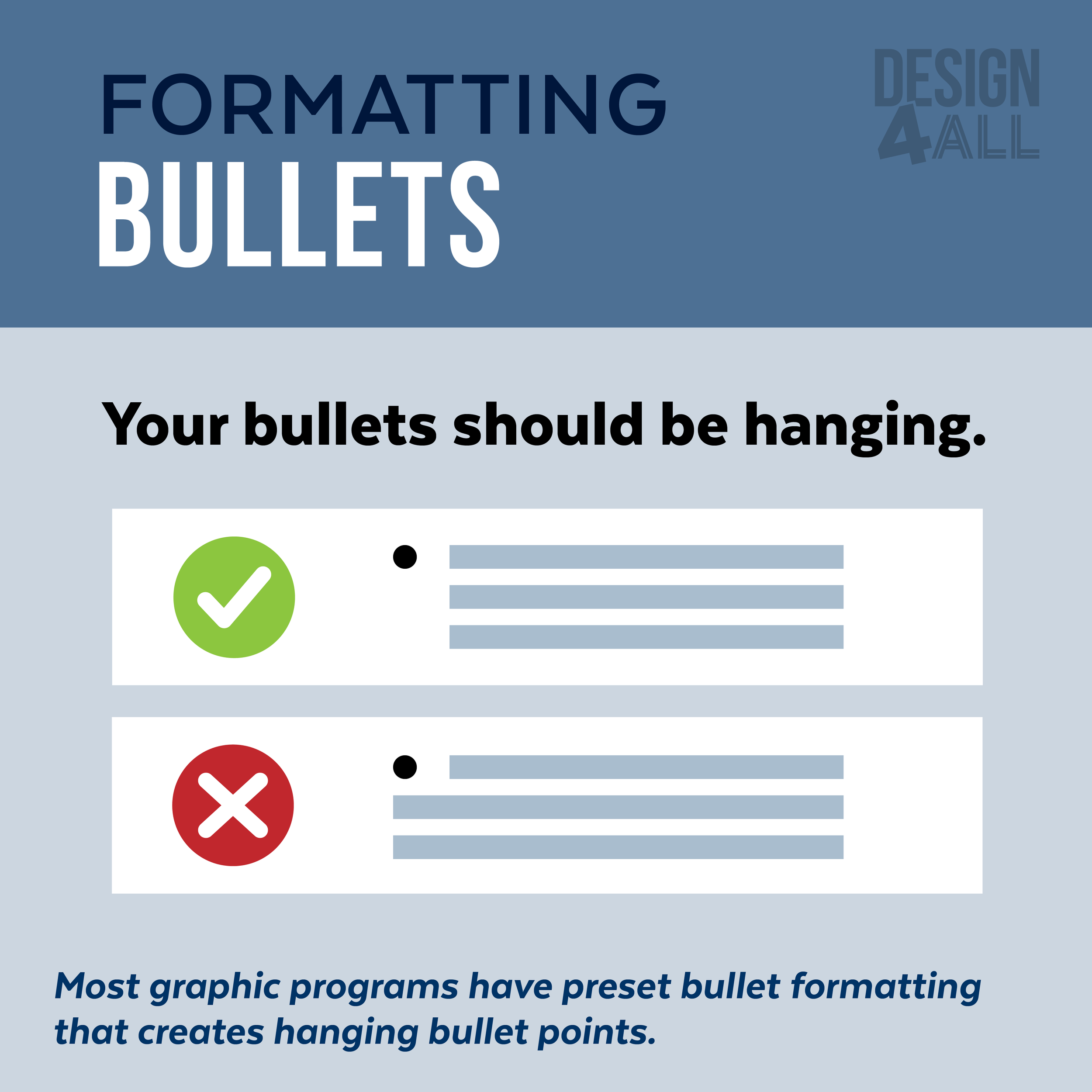
Hanging Bullets: with hanging punctuation the flow of text on the left-hand side is uninterrupted.
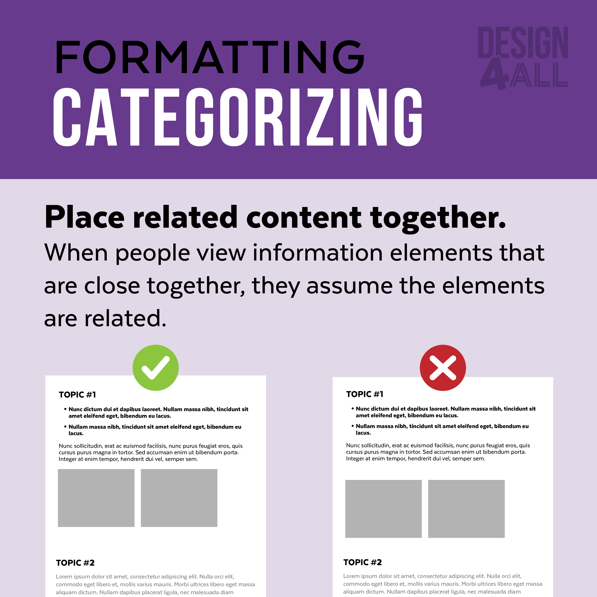
Vertical spacing separating bullet content
Alignment & Margins
Alignment
Align text and graphics to the left—Unless you’re trying to emphasize one area (such as the title).
Having content aligns provides margins and makes it easier to organize the content effectively.
White Space
It is very important to use “white space” (space without content) to break up the content.
This space will enable to reader to find information easily without being overwhelmed by text or graphics.
Margins
Margins are the areas between the main content of a page and the page edges—the margin helps to define where a line of text begins and ends.
Margins are created by aligning your content.
Margins provide space for the eye of the reader to “rest” and guide their eyes to the content in a less overwhelming manner.
Column Width
The ideal column width is 52–65 characters wide—2–2.5 alphabets wide (2 x 26 letters=52)


